Cisco

Momentum Design

alt
  • User Research
  • Experience Design
  • Interface Design

Momentum Design is Cisco’s design system that elevates the design experience for Webex through seamless collaboration and innovation.


The system is strategic, holistic, inquisitive, streamlined, and dynamic, centering around the needs of the users and the business.


Introduction

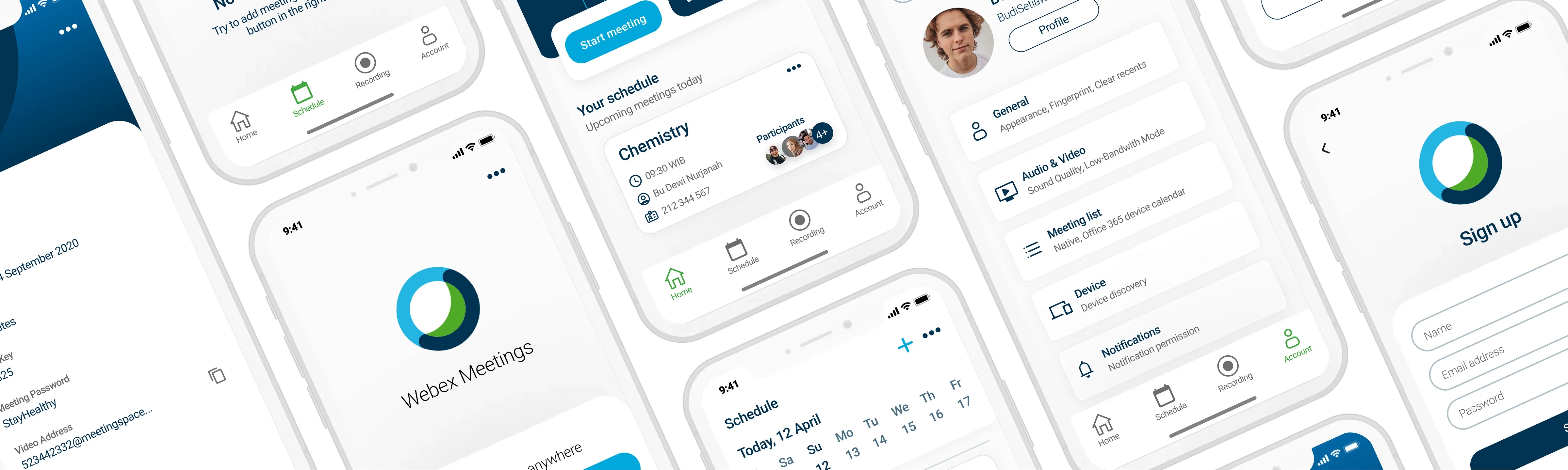
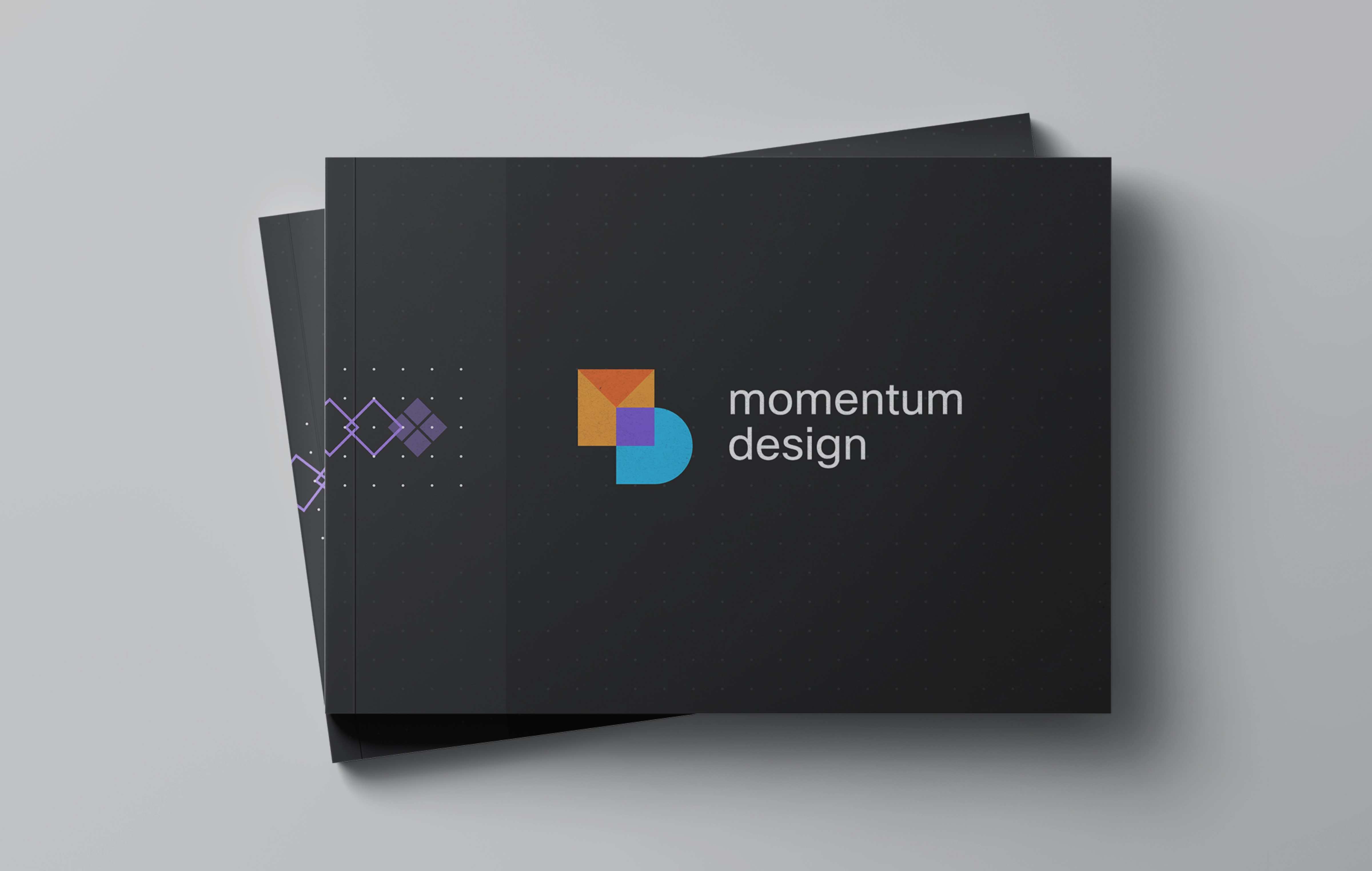
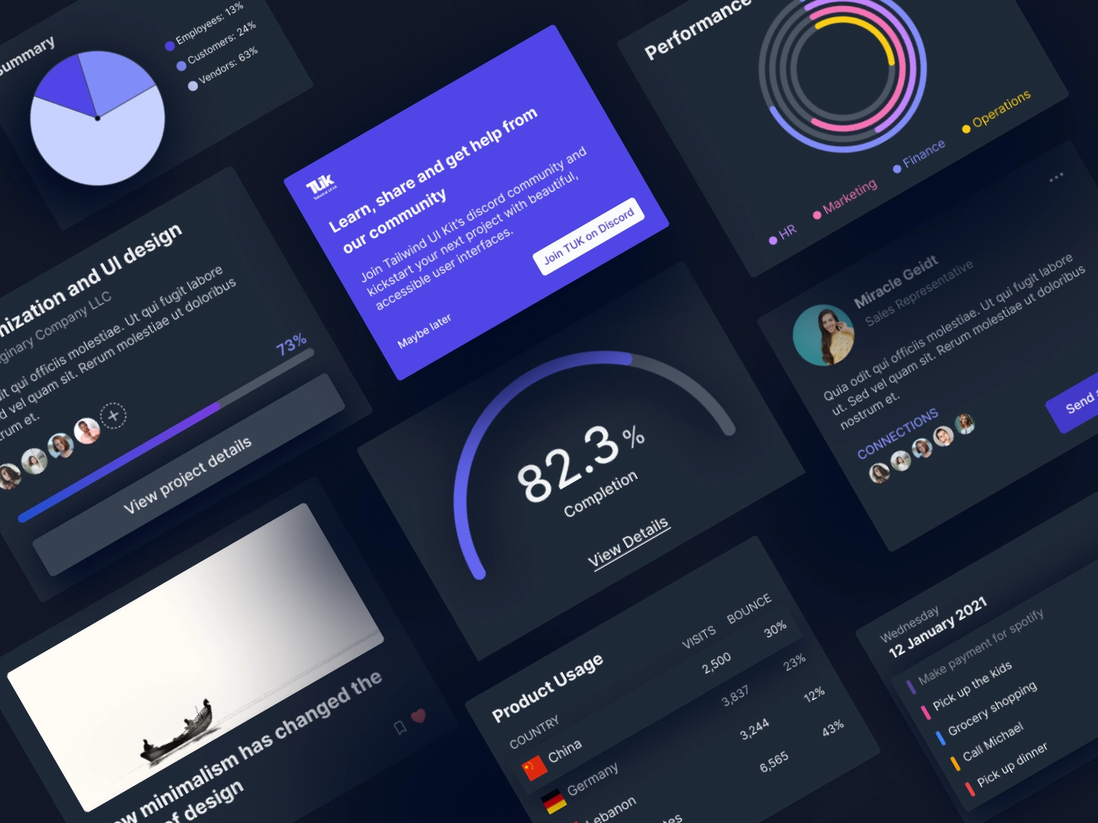
Overview: This case study delves into the development and implementation of Cisco’s Momentum Design system, a comprehensive UI/UX framework that has revolutionized the way Cisco’s products are designed and experienced.

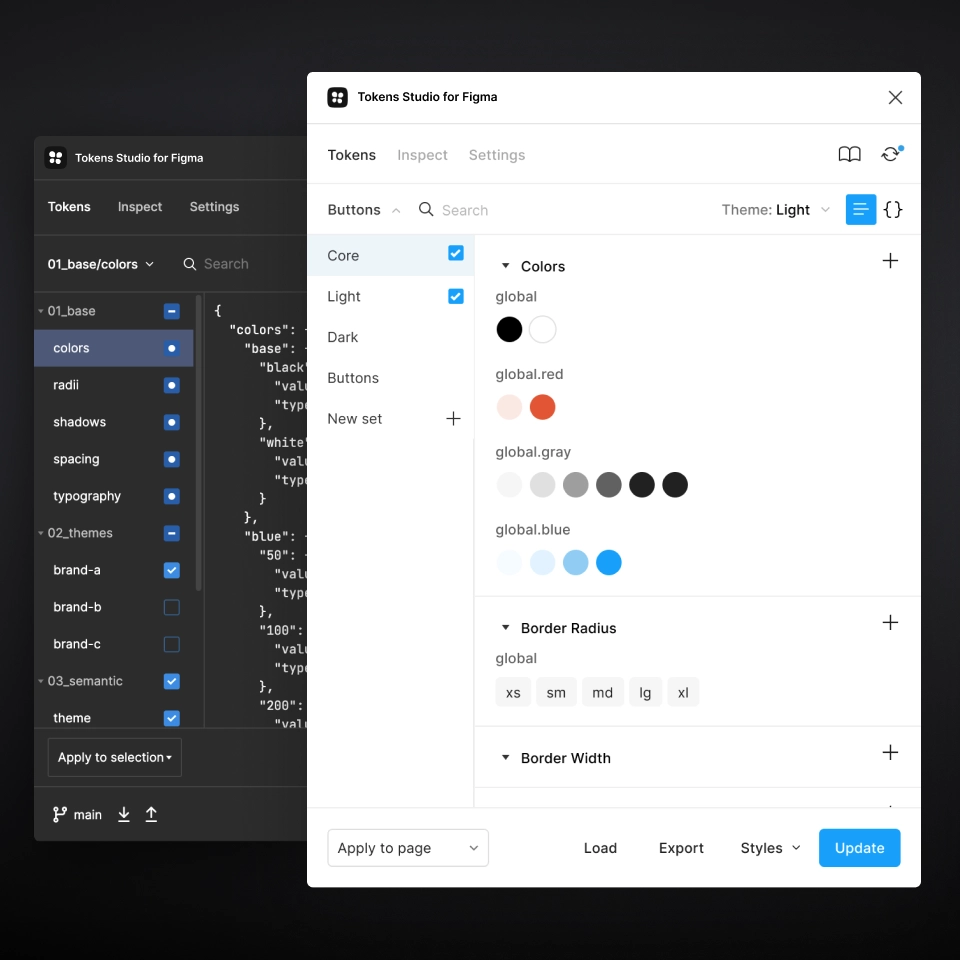
Personal Contribution: As a Principal Product Designer, I played a pivotal role in shaping the design system’s strategy, ensuring its alignment with Cisco’s brand values and technical requirements.

Seamless
Vibrant
Focused
Personalized

Challenge

The Need for Consistency: Cisco’s diverse range of products suffered from a lack of visual and functional consistency, leading to a fragmented user experience and inefficiencies in product development cycles.

By creating an updated centralized design system, we aimed to:
  • Align our many, many teams
  • Speed up our design and development process
  • Improve brand perception and user trust
  • Promote accessibility of our products

Audit

We used Brad Frost’s interface inventory guideline as inspiration to conduct a full-day audit that we ran as a team of 5 designers and 2 lead developers.
As you can see, we had many different colors, font sizes, and spacing values, among many other issues.

Inventory

We compiled these findings into a UI Inventory of our main interface components.

We identified a lot of inconsistencies in our design assets, which only proved the need for a more systematic approach to documenting, communicating, and maintaining our design system.

Approval

In order to ensure the success of this project, it was important to get stakeholders on board before we start building our design system.

We systematically promoted the initiative via:
  • A kick-off presentation with key stakeholders
  • Bi-weekly design system meetings with Engineering
  • Team-wide work-in-progress and roadmap updates

By getting other teams involved from the onset and as the project evolved, we strived to promote understanding of the project and inspire a sense of co-ownership throughout the entire process.

Exploration

We decided to focus first on the foundational elements (atoms) of our design system, such as color palettes, fonts, grid, spacing, buttons, etc., and then move on to more complex blocks and pieces (molecules, organisms, templates, pages).

Some of the activities at this stage involved:
  • Researching other design systems and interfaces
  • Analyzing the instances and use cases captured during the audit
  • Unify different variations of components to leave only the essentials
For example, we limited our color schemes; all of the excessive variations were matched and merged with the decided upon schemes based on proximity.

Below is our final color palette:

Documentation

We set out to produce design-led and development-led documentation that is integrated and synced to create one consolidated system.

We systematically promoted the initiative via:
  • A kick-off presentation with key stakeholders
  • Bi-weekly design system meetings with Engineering
  • Team-wide work-in-progress and roadmap updates

By getting other teams involved from the onset and as the project evolved, we strived to promote understanding of the project and inspire a sense of co-ownership throughout the entire process.

Figma

My first task was to get the Tailwind components we were going to use to into Figma and create white-labels variants for each.

From there, we created different tokenized skins depending on user-choice or platform.

Zeroheight

We use Zeroheight, a collaboration platform that integrates with Figma and allows product teams to create and maintain web-based design system documentation.

Storybook

We built our new repository from scratch in Storybook, a tool that allows to create an interactive pattern library for code in isolation and supports all the popular frontend frameworks.

Tailwind CSS

We built a Tailwind configuration based on our design system fundamental variables and use it to more easily enforce design system constraints within both of our main technology stacks.

Accessibility

Having the opportunity to build a Design System from scratch meant that accessibility became part of the process, rather than an afterthought.

Some of the key principles taken into account were:
  • Checking colour contrast on different background and across different interaction states
  • Ensuring font size + touch targets on mobile are appropriate
  • Including text labels with icons on mobile navigation
  • Consistency across layouts and similar UI elements

Guidelines

We limited the number of components to keep the library light and to create more thorough guidelines & discover more opportunities for use.

Let's take a look at the guidelines for the Avatar component.

Avatar

Use Cases

Avatars can be used in a variety of settings, such as profile pages, user settings, or in a list view.

When To Use

Displaying a user's profile image or initials in a user profile, comments section, or messaging application.

Displaying the profile image or initials of a group or team in a project management application or collaboration tool.

When To Use

Displaying images or icons that are not related to user profiles or identities.

Using the Avatar component to display images or icons that are too small to be recognizable.

Types

  • Photo
  • Text
  • Icon
  • Multi-User

Text, icon, and multiuser background colors

Designers should feel free to change the background color of the Text, Icon, and Multiuser Avatars, wit our theme tokens.
However, do not change the text or icon color of the component.

Behavior

Avatars can be either static, or interactive elements.
If interactive, they will behave like buttons.

Dos & Don'ts

Do change text, icon, and multiuser backgrounds with the appropriate common tokens if your design requires it.

Don't change text or icons within the avatar.

Do change text, icon, and multiuser backgrounds with the appropriate common tokens if your design requires it.

Don't change text or icons within the avatar.

Outcome

After a few quarters of performance and a few fast-follow components, we saw an increase in velocity in both design & development and an increase in planning accuracy.