Cisco
WebEx
- Research
- Experience Design
- Interface Design
- Visual Design
Cisco WebEx is a video conference app designed & developed for businesses, allowing users to easily join online meetings from everywhere, on any device with high-quality video.
I contributed as a Product Designer on the Mobile & IoT team, creating solutions for iOS/Android & Cisco Hardware products alongside a team of around 60 Developers, Designers, & Product Managers.
Problem
Due to Cisco's enterprise customer base, contracts were initially easy to attain, but renewals were low as the teams that were meant to use WebEx had previously adopted a competitor product.
Discover
First I familiarized myself with artifacts our Lead PM had created to outline the business needs, project scope, and success metrics.
Then I created a schedule for the next sprint to engage with key stakeholders & customers and gather information to inform our hypotheses and help determine what we prioritize.
Interviews
I facilitated over a dozen remote interviews, working loosely off a script with a PM taking notes.
We met with several personas from executives to individual contributors to see if our product was meeting expectations and where we were under-performing.
From there, we performed a competitive analysis of the top apps we heard customers mentioned from our product class.

We also compiled all of the reviews we could find anywhere that rated WebEx under 3 out of 5 stars or less.

Finally, we did an interface and feature audit to see how our experience and feature set compared to our top competitors.

Hypothesis
After a sprint of discovery it became clear that the product had many of the same features & performance as our competitors, but the experience was difficult to use.
The team leads decided the best course of action was to improve the experience to grow adoption and forego chasing the implementation new features.
Outcome
Leadership and Product decided the best way to benchmark future success was tracking consumption growth.
Key Actions per Session was chosen as DAU wasn't granular enough to articulate the usage of key features such as Teams & Meetings.
Metrics
01
Increase in Session Duration
02
Increase in Teams Created
03
Increase in Meetings Attended
Define
The following sprint we laid all of the pieces out on the table, so to speak, and began synthesizing the data into something meaningful for our key stakeholders.
Affinity Diagram
My first goal was to create categories of data blocks and group them to help determine the volume of feedback we received regarding certain features.

Personas
Based on the roles and attributes of my interviewees and a number of other sources, my PM and I began drafting personas to use in our flows, journey maps, and service blueprints.

Job Stories
I used the Jobs To Be Done framework to create job stories based on user interviews and reviews to understand their motivations, situations, and outcomes in using a video conference mobile app.
When I sign in, I want to have an automatic opt-in to join my latest meeting, So I can effortlessly attend.
Develop
At this point I had enough information to create maps and designs with which to create screens and prototypes to test with colleagues and users.
My process is iterative, so I build & test regardless of the fidelity of the solution; my idea is to test & benchmark it thoroughly before it gets to implementation.
As an example, let's run through an example of what that would look like with my work on the Meetings feature.
Task Flows
I started outlining flows for certain functions in their current form and then began simplifying to create a more concise experience.

Site Map
Once I had enough flows mapped out, I spent time designing a site map to outline the hierarchy of each screen.

Wireframes
The top of the interface design funnel begins with wireframes to make a number of high-level click-throughs and do some light testing to tune my assumptions.
I've become faster creating wireframes than with pen & paper, so I forego sketches and just start moving blocks around.


Screen Flows
I took a look at materials from our interface audit and start mapping current screen flows, considering how to redraw them to improve usability & understandability.

Prototypes
I tested the wireframes with several stakeholders to see if I was on the right track.
As feedback improved, I felt confident to take some of my ideas up to a more high-fidelity deliverable using either Figma or Protopie to create something the closer resembles the end product.

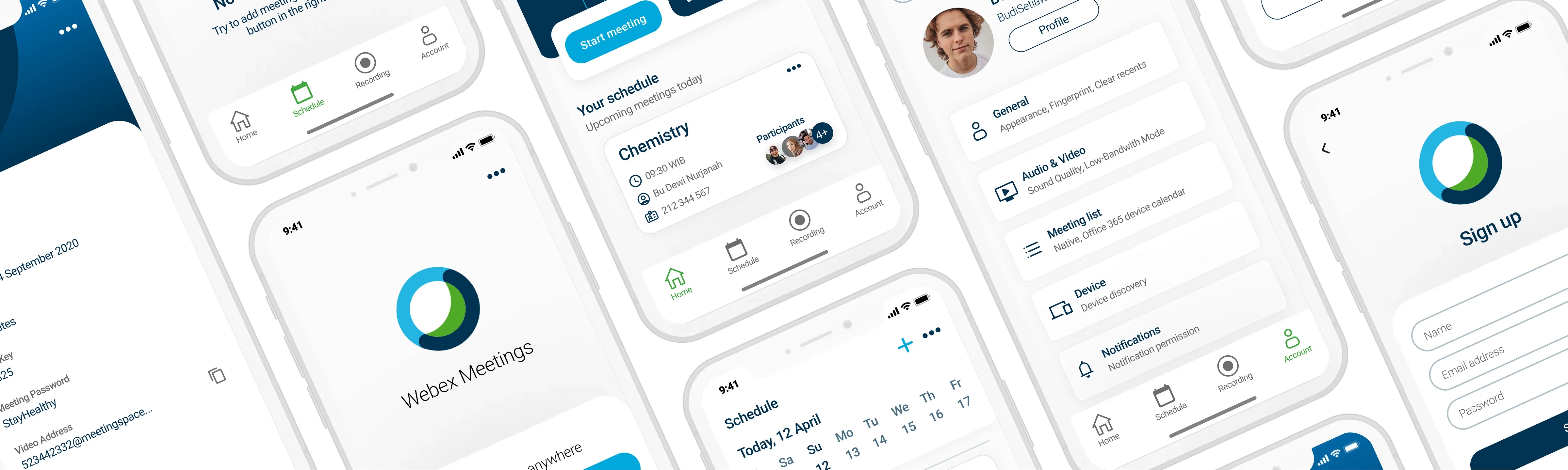
Home Screen
My first improvements were to the Home Screen, creating a more immediate and informative experience that the previous version.

Schedule Screen
For viewing and scheduling meetings, I decided to add more detail and functionality to each entry at the expense of less visible entries.

Meeting Flow
Once I had some initial designs in implementation, I began working out the main flow for one of the biggest features; Meetings.
This would have implications on the way we handled the Teams & Scheduling features, but also the way we reused microinteractions from different screens in the app.


Deliver
At this point, my job is to test my solutions, submit them for implementation, and review the analytics to determine what to work on for fast-follow features to get our metrics where we want them.
Validation
For each prototype, I created a script and either use Maze, Optimal Workshop, or the in-house Research team to set up a validation sessions with actual users.
If it passed the desired metrics, I'd move to implementation.
Stories
While the Devs and PMs usually start the Epics & Stories we use for the roadmap, I supplement them with acceptance criteria, red lines, prototypes, and videos.
My goal is make sure that the Devs can confidently implement without having to constantly break flow to ask about certain details and I can expect a reflection of my prototypes when we review the app.
Review
And now I review the dashboards in Pendo, Tableau, or FullStory, send out questionnaires & surveys, and speak directly to customers to figure out what's working and what needs updating.
Outcome
After a few quarters of performance and a few fast-follow features, I'm happy to say that we saw sizeable increases in all of the metrics we wanted.